
When I joined Mycle, a car-care app in Korea, there was a suggestion that the logo looked dated and the brand might need a refresh. There were things worth fixing. The shadows and reflections felt like an older visual style, and the gradients were awkward to use in print.
But how far should that work go? A few adjustments to the logo, or a bigger change to the way the brand presented itself?
At my previous company, OP.GG, I had led a rebrand that kept the logo and expanded the visual language around it. At Mycle, I refined the logo as part of strengthening the existing brand. Same designer, different decisions. The question behind both was simple: what kind of change did this company need?
A Brand That Needed More Room
OP.GG was well known for League of Legends statistics. For players, it was a familiar and useful name. The company was expanding across games and services, and the brand needed room to express that direction.
We wanted to move from a place to check your stats toward a broader platform where gamers could find things to enjoy and relate to. The scope of what we wanted the brand to represent was growing.
That didn't give us a reason to change the logo. It was distinctive and familiar to users. It also spelled out the service’s name and URL, which made it immediately clear and useful.
The brand had a history of playing with the logo, using it in illustrations and physical displays. It already carried recognition, memories, and a visual heritage of its own. There was plenty worth keeping.

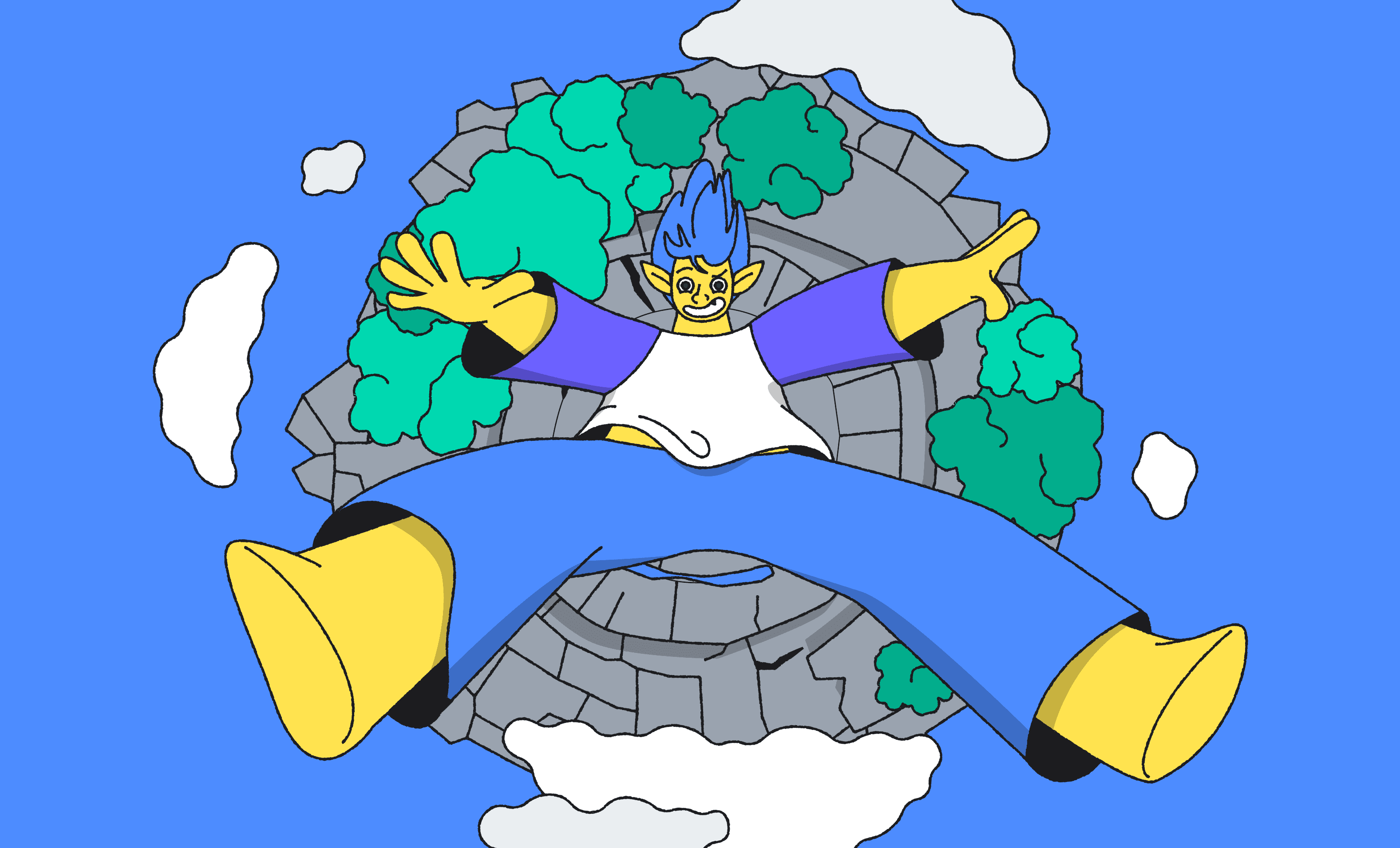
We kept the logo and established systems for color and typography around it. Then we expanded the brand through a dynamic illustration style full of life, along with characters and a world of their own. Together, they made the idea of a “Gamers’ Universe” visible. We could bring gaming references and recognizable player situations into that world in ways product screenshots couldn't.
Rather than adding a statement saying we were now a broader platform, I wanted to show the world people could find there. The familiar logo remained the anchor that made it recognizable as OP.GG. The rebrand carried that heritage forward while giving the brand more stories to tell and more ways to express itself.
A Brand That Needed Reinforcement
At Mycle, by contrast, the direction shared across the company was about making the existing service better.
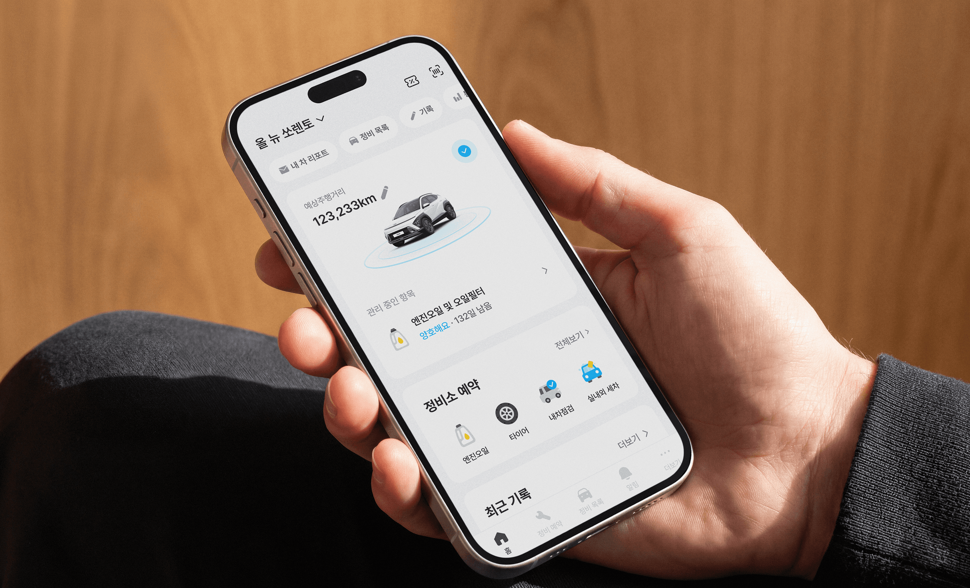
Help users record and connect their vehicle data. Use that information to keep track of maintenance and replacement needs. Make it easy to book a service when the time comes. Easier data connections, a smoother booking process, and more relevant recommendations all supported the same direction.
The company was strengthening what it had already set out to do. It wasn't trying to explain a new kind of business.
I saw a similar task on the brand side. Given the position the service had built, I felt there was still work to do in helping people understand what Mycle could do for them. In my view, we hadn't yet done enough to repeat a consistent message across the places people encountered the brand.
Introducing a new identity would also mean helping people get familiar with it. If the existing brand could express where the company was going, there was a good reason to put our energy into making that brand better known.
So I Changed What Needed Changing
That didn't mean leaving the dated details alone.
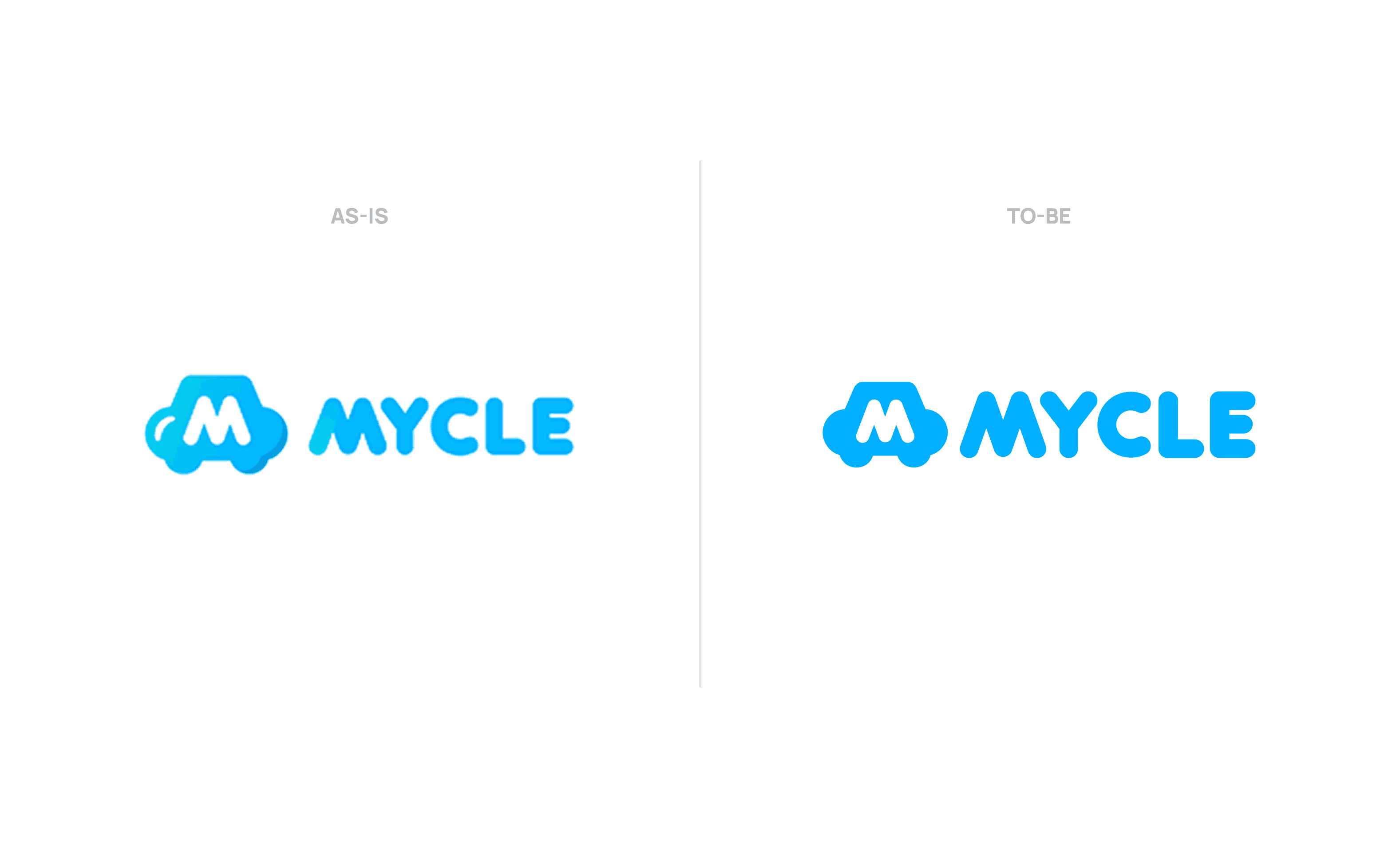
I removed the pronounced shadows and reflections from Mycle’s logo, along with gradients that made it harder to use in print. The aim was to make the existing identity easier to work with across different applications.
It was a smaller visual change than a full rebrand, but it fit the task in front of us. We could use the refined logo and put more attention into communicating what Mycle did, with a consistent voice over time.
Deciding to keep a brand leaves a great deal of work ahead. Once you know what you're keeping, you still have to show it, explain it, and give people reasons to remember it.
Before Looking at the Logo, Look at the Direction
Those two experiences gave me a few questions I now start with:
What is the company trying to do next?
Can the existing brand express that direction?
Do people need to understand us differently, or get to know us better?
The answers help me work out what to keep and what to change. OP.GG needed a broader world of expression built around its familiar logo. Mycle needed to communicate the direction it had already chosen more clearly and consistently.
As a brand designer, I can usually find something I'd like to improve. Choosing which of those things needs attention now is part of the design work, too.
So when a logo looks dated, I start by looking at where the company is going. Then I decide what needs to change.